OHV Volunteer Shield

DRaider90

Uwharrie Off-Road Volunteering
Joined
Oct 23, 2007
Location
Weddington, NC
The Forest Service has their shield:
aupload.wikimedia.org_wikipedia_commons_thumb_9_98_Forestservif1d2c40086a632c684aeb1c98581f74a.png


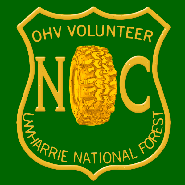
Now we have our own:

aimg514.imageshack.us_img514_4091_volunteerchevron.png


Made from scratch, no copy and pasting anything. Not even the shield design.

This will be used on t-shirts, hats, etc. A more official look for us to wear out on the trails. I may change it a little, including the top double dip of the shield design. But I figured we would want it to look a little bit different.
 
i like it! i want a shirt, and a decal.
 
We've received hats in the past with the FS volunteer 'shield' on them. I like that design better.

Maybe I'm getting old, but everything we do or wear should speak to the work we do. Not the fun we have. I'm not sure a swamper portrays the right image.

I've had neumerious people in the past ask about my simple/basic green FS vol. hat and then I've explained what things we do and how important it is. Can't say 1/2 of those people would have bothered to ask if there was a tire in the picture.

just my .02
 
I tend to agree with Mike on the swamper thing. Hats are a good thing, but I would like to see the shield on them changed to be exactly as the original Forest Service Shield (top), but replace "Department of Agriculture" with "Volunteer". I would also wouldn't mind having a couple decals of the same design to put on my Jeep.
 
after reading the last two opinions i agree, people may see the tire and just think its another off roader shirt. the more people who ask questions, the more people might get interested. thats what we need. either way, im all for it and will deck my rig out with it. hell my truck is forest green anyway, i big badge like that on each door would be cool!

on second thought though, i do have TSL's on my rig and would love to keep the tire lol. maybe just do both styles and people pick which one they want.
 
We've received hats in the past with the FS volunteer 'shield' on them. I like that design better.

Maybe I'm getting old, but everything we do or wear should speak to the work we do. Not the fun we have. I'm not sure a swamper portrays the right image.

I've had neumerious people in the past ask about my simple/basic green FS vol. hat and then I've explained what things we do and how important it is. Can't say 1/2 of those people would have bothered to ask if there was a tire in the picture.

just my .02

I agree.
 
I concurr, maybe a shovel and a ax crossed or something on those lines. Great work by the way Ely! I'd wear a t-shirt if I was given the chance to buy one. And the stickers also. What was the problem with your ride the other night?
 
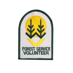
The original Forest Service Volunteer badge is this:

awesternheritagestore.com_Merchant2_graphics_00000001_FS214.jpg


awesternheritagestore.com_Merchant2_graphics_00000001_FS307.jpg


It is neat looking, but it has no OHV Reference what so ever.

I like the idea of using more of the official FS Badge but after my talk with Janet during the past work day I want to avoid this. The Forest Service is VERY serious about who gets to wear the FS Badge, or anything that looks like/can be confused with one.

Here are 2 revised versions, let me know what you guys think.

preview2w.jpg
 
The badge design isn't strictly a Forest Service item. Its used widely by a lot of different groups, and even variations are used for Highway signs:

awww.routemarkers.com_states_US_40.gif


There shouldn't be an issue using it, or a something similar. I can change the design, but that would be if people don't like the current one. I hope I am not confusing anyone.
 
Your #2 revised looks the same as the first one you posted.. so I am confused on that bit. I will say I don't really like the tire. Nor am I a big fan of the crops and V. What about something similar to a trail and a rig or even like this:

volunteer-trail-patrol-transparent.png
 
Your #2 revised looks the same as the first one you posted.. so I am confused on that bit. I will say I don't really like the tire. Nor am I a big fan of the crops and V. What about something similar to a trail and a rig or even like this:

volunteer-trail-patrol-transparent.png

I took off the bevel on everything, plus adjusted the badge design so it looks less like a highway sign (on the top). But yes its still pretty much the same as the original as far as the tire goes.

I like the trail patrol logo, gives me ideas for our own trail patrol group we are starting on here. I am sure design elements from it can be incorperated into a general volunteer badge if not also the trail patrol badge. Good find, I will see what I can do.
 
If the FS says "Don't use our shield", I'm pretty sure that means, don't use their shield.

There's an official volunteer logo. Use it.
 
The original Forest Service Volunteer badge is this:
awesternheritagestore.com_Merchant2_graphics_00000001_FS214.jpg

awesternheritagestore.com_Merchant2_graphics_00000001_FS307.jpg

It is neat looking, but it has no OHV Reference what so ever.
I like the idea of using more of the official FS Badge but after my talk with Janet during the past work day I want to avoid this. The Forest Service is VERY serious about who gets to wear the FS Badge, or anything that looks like/can be confused with one.
Here are 2 revised versions, let me know what you guys think.
preview2w.jpg
I think those bottom 2 proposals look like/can be confused with the FS Badge.
How about you use the Volunteer badge the FS authorozed, and add a line of text in identical font that says OHV TRAIL MAINTENANCE or something below it.
 
I've resisted my input on this to this point... But I can't take it any longer.....

Does it matter that were with the OHV ? Possibly our efforts should further EVERYONEs involvment with the FS. We should be setting the example for others to follow. With a basic sticker, patches, cups, hats more people will be included to use/wear them and that will further the spread and recognition of the volunteering aspect, not just the OHV aspect.

Let me be more clear...

If you go with the standard FS volunteer design I WILL use/wear it.

If you use a design that has a swamper on it I will NOT use/wear it.

I'm sure our tax dollars paid a good amount for them to come up with that design. I like it, its simple, easily recognized, doesn't isolate or segment one group of users from others.. Why can't we just use the standard design as is.

Here is how I see it... You've asked for peoples input, they have been very kind in their responses and suggestions. And you've basically done what you want to do..

Maybe we should have another poll.....
 
My vote would be to use this:
 

Attachments

  • FS214.jpg
    FS214.jpg
    25.8 KB · Views: 549
My vote would be to use this:

X2

My thinking is that there is WAY too much emphasis on things that aren't really necessary like, badges, stickers, signs, etc. I would prefer a more low key approach while still assisting the FS to make the OHV trails better and safer.
 
My thinking is that there is WAY too much emphasis on things that aren't really necessary like, badges, stickers, signs, etc.

Exactly. This is not a productive use of our time.
 
Exactly. This is not a productive use of our time.

The point of badges and stickers etc is to help raise money for the group, and to raise awareness. And yes through sales of stickers/shirts/hats etc we could say put $1 or $2 of the price torward the group/supplies/etc.

If everyone agrees this is a waste of time I will drop it and try to figure out other ways of raising money and awareness.

As far as the shield design goes the idea was to create something NEW. IE something different than the current Volunteer Patch. If people just want to use the old Volunteer design then so be it. But I figure this is a reason why its not very popular/wide spread. And the OHV part of the design idea was to convey that we are apart of the OHV crowd, NOT that we only volunteer/help on the OHV Trails. Its the same concept as a club, you want people to know what group you are apart of to show what we are doing out there. We aren't the Equestrian riders, we aren't the hikers, we are the OHV riders. Maybe its just me but I think it is a positive thing for people to know the OHV crowd is being apart of the volunteer efforts.

You want a logo that people can understand/get the idea about even if they aren't able to stop and talk to you about it. Because not all circumstances allow for you to stop and talk with the person etc. You want the logo to convey that you are a volunteer, working in the Uwharrie National Forest. And beyond that I would like to convey that we are apart of the OHV crowd. So maybe is someone that wheels sees it, they would think hey maybe that is something I can get invovled with.

Its cool if people are able to stop and ask questions, so you can tell about what you are doing. But the bigger thing is are you reaching the people that aren't getting to stop and talk to you. And at least in my opinion the old crop/tree style patch doesn't do that. But again if we want to just stick with the old design, so be it. I am not going to try and shove my ideas down anyone's throat.
 
Back
Top